Springboard Capstone Project — Summer 2023
Designing a better way to monetize premium music content

Timeline
2 weeks
Role
UX Researcher, User Interface Designer, Usability Testing
Tools
Figma
Miro
INTRODUCTION
As part of my Springboard bootcamp capstone project, I worked on a design challenge for Songbird, a fictional startup media company. Songbird launched a music streaming platform two years ago, utilizing a freemium model to build a strong and engaged user base. With a solid foundation in place, the company is now looking to expand its feature set to effectively monetize a premium product offering.
PROBLEM
Struggling to convert free users into paid users
Songbird has successfully attracted a strong user base with its free music streaming platform. However, the company now faces the challenge of effectively monetizing its product. To achieve this, Songbird aims to develop a premium version of the app that not only appeals to users but also drives consistent subscription revenue. The focus is on creating an experience that converts free users into paying subscribers while ensuring sustainable growth.
COMPETITIVE ANALYSIS
Users are driven to upgrade through ad-free experiences, unlimited skips, offline listening, and personalized recommendations
I started the project by conducting a competitive analysis of the call-to-actions used by competitors in the freemium versions of their products. My focus was on comparing Songbird to Spotify, Pandora, and YouTube Music. From this analysis, I found that all three platforms offered key premium features, such as an ad-free experience, unlimited skips, offline listening, and personalized recommendations, to incentivize users to upgrade. In terms of call-to-actions, most of the competitors had a dedicated page detailing their premium offerings, along with multiple calls to action and ad breaks strategically placed throughout the app to encourage upgrades.

USER FLOWS
Calls-to-action during sign up process and within the app
I developed two detailed user flows to illustrate the actions users would take to upgrade to premium. One flow focuses on the sign-up process, mapping out the steps from initial sign-up to subscription, while the other flow outlines the steps within the app itself, guiding users through the in-app upgrade experience.
Sign Up Process

Within the App

LOW FIDELITY WIREFRAMES
Building on the user flows, I created low-fidelity wireframes to visualize potential layouts for the app, highlighting where and how calls to action for upgrading to the premium version would be strategically placed both during the sign-up process and within the app itself. These wireframes aimed to provide a clear, intuitive user journey for upgrading to premium.

USABILITY TESTING ROUND 1
Issues with sensitive information, no visible pricing and subscribing upon signing up
Once I created the wireframes, I conducted a round of usability tests to find areas of improvement before creating the final high fidelity screens. From the tests, I found that there were three main issues with the design.
Users not understanding the reason they're being asked DOB and gender
No visible pricing shown in Premium page within the app
Users feel that they won't immediately subscribe to Premium upon signing up
THE SOLUTION
Dedicated Songbird Premium gage, strategic ad breaks, multiple calls-to-action throughout app
Users can read about the premium plans offered and have the option to immediately subscribe during sign up by clicking on the “View All Premium Plans” button.


Once in the Freemium app, there is a dedicated page for Songbird Premium in the bottom navigation bar that users can easily come back to if they ever decide to upgrade.
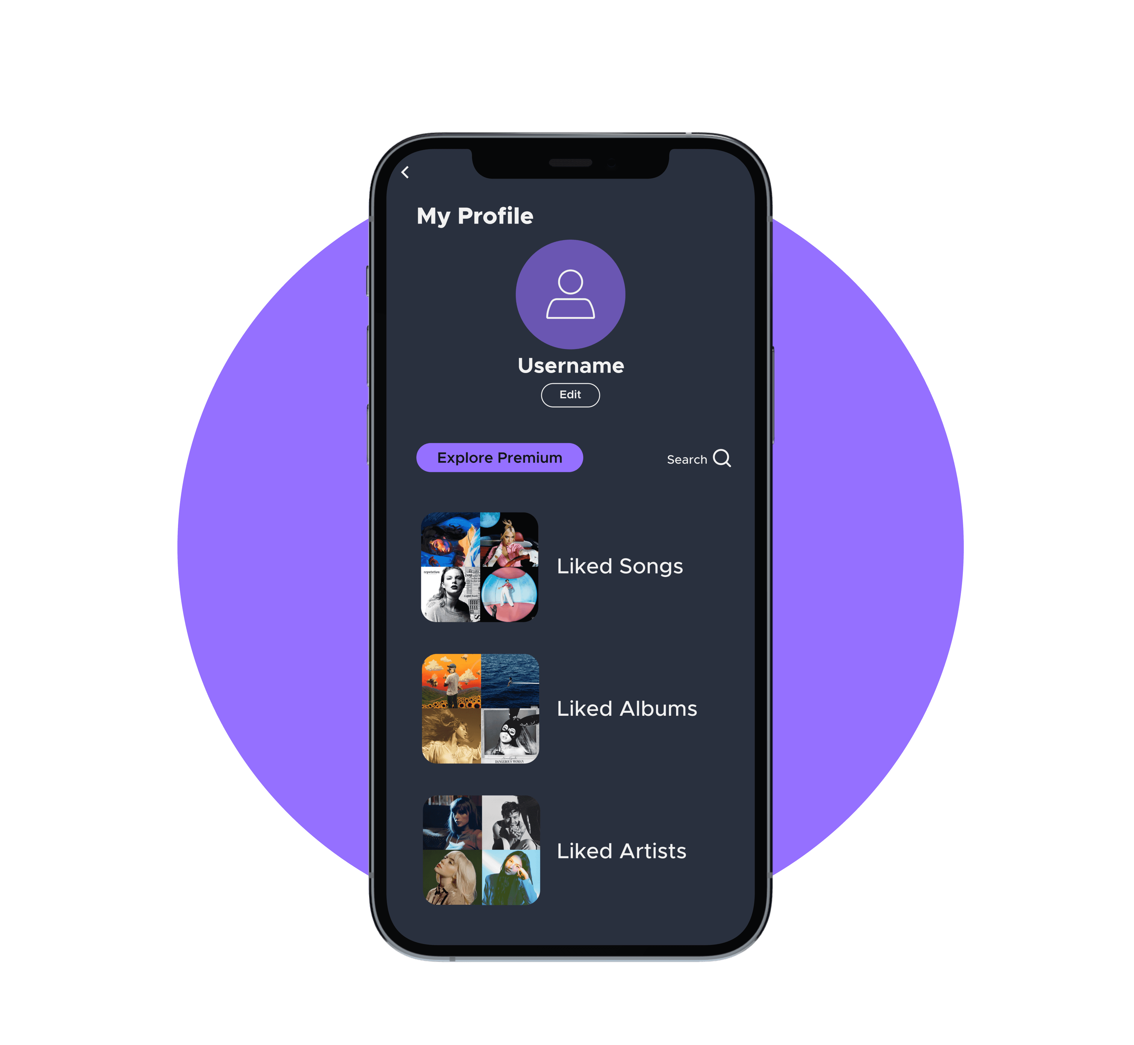
Users can also find another way to upgrade to Songbird Premium through the “Explore Premium” button that can be found under their profile page.

The Freemium version of Songbird utilizes advertisement breaks after every few songs and when the user wants to play a specific song as a strategy to encourage users to upgrade to Songbird Premium.
USABILITY TESTING ROUND 2
Offered plans over comparisons, too much text, price sizes too small
Once I designed the high fidelity screens, I conducted another round of usability tests to identify any other problems there could have been with the design. Although there were improvements from the first round of usability tests, there were still a few minor problems that needed to be addressed and made the necessary edits to the final design.
Participants pointed out that there was too much text in the Premium Plans page
Text size of the prices were too small to read and unnoticeable at first
Users prioritized the plans offered and the prices rather than the comparison

REFLECTION
Overall, I found this project to be highly enjoyable. Creating a detailed project plan with specific deadlines throughout the two-week timeframe helped me stay organized and consistently track my progress.
The business goals outlined for this project challenged me to develop the most effective strategy to promote the premium version of the app while ensuring a seamless user experience for free-tier users, despite the limited features and ad interruptions.
In hindsight, one area for improvement would be the research conducted during the “Discover” phase. While the competitive analysis provided valuable insights into our competitors’ strategies, I recognize that conducting user interviews or surveys could have added an even more user-centric perspective to the project, leading to a more refined and tailored solution.
Connect with me!